The Importance of Mobile-Friendly Web Design in 2025
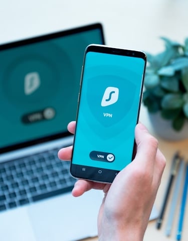
You can't take your laptop everywhere!
MARKETINGBUSINESSDEVICES
The Importance of Mobile-Friendly Web Design in 2025: Why It Matters for Your Business
At Sapphire Arts, we understand that in 2025, mobile-friendly web design is no longer a luxury—it’s a necessity. With more than half of web traffic coming from mobile devices, ensuring your website is optimized for mobile users is crucial to staying competitive. A seamless mobile experience can enhance user satisfaction, increase conversions, and improve your brand’s reputation. Here’s why mobile-friendly web design is vital in 2025 and how Sapphire Arts can help you stay ahead of the curve.
Why Mobile-Friendly Web Design Matters
Over 50% of Web Traffic Comes from Mobile Devices
As mobile usage continues to rise, your website must cater to the growing number of users browsing and shopping on smartphones and tablets.
A mobile-friendly website ensures that you’re not missing out on a significant portion of potential customers.
Search Engines Prioritize Mobile-Optimized Websites
In 2025, Google’s mobile-first indexing means that search engines prioritize mobile-friendly websites in search results.
Websites that aren’t optimized for mobile may see lower rankings, which can lead to reduced visibility and traffic.
Improved User Experience
A mobile-friendly design creates a smoother, more enjoyable experience for your visitors, reducing bounce rates and encouraging them to stay longer on your site.
If your website isn’t easy to navigate or takes too long to load on mobile devices, visitors will likely leave before converting.
How Sapphire Arts Can Help You Achieve Mobile-Friendly Web Design
Responsive Design
We specialize in creating responsive websites that automatically adjust to any screen size, ensuring an optimal experience for mobile, tablet, and desktop users.
Whether your visitors are on a phone, tablet, or laptop, your website will always look and function perfectly.
Fast Loading Speed
Mobile users expect fast-loading pages. Slow sites are a major turn-off and can lead to lost conversions.
At Sapphire Arts, we ensure your site is optimized for quick loading times, improving user experience and boosting your search engine rankings.
Streamlined Navigation
Mobile devices require simplified, intuitive navigation for easy browsing and a seamless experience.
We design websites with mobile-friendly navigation, ensuring your visitors can find what they need quickly and efficiently.
Optimized Content
Content must be legible and accessible on smaller screens. Text should be easy to read, and buttons must be large enough to tap without difficulty.
Sapphire Arts makes sure your content is optimized for mobile, making it readable and engaging across all devices.
Conversion-Focused Design
Mobile users often have specific needs and behaviors compared to desktop users, which is why conversion-focused mobile design is essential.
We create mobile-first designs that encourage action, whether it’s making a purchase, filling out a contact form, or signing up for your newsletter.
Why Choose Sapphire Arts for Your Mobile-Friendly Web Design Needs
Our team specializes in creating websites that perform seamlessly on mobile, desktop, and all other devices.
We prioritize user experience, ensuring your site is not only mobile-friendly but also designed to convert visitors into customers.
At Sapphire Arts, we stay up to date with the latest trends and technologies, so your website will be ready for the future of mobile web design.
Conclusion: Future-Proof Your Website with Sapphire Arts
In 2025, a mobile-friendly website isn’t optional—it’s essential for your business’s success. With mobile traffic continuing to grow and search engines prioritizing mobile-first sites, it’s more important than ever to ensure your website is optimized for all devices. At Sapphire Arts, we’ll help you create a seamless, responsive, and conversion-focused website that enhances user experience and drives business results. Let us help you future-proof your online presence with cutting-edge mobile-friendly web design.
Sapphire Arts
204 Cascade Dr. #37
Lebanon, OR 97355
541-220-9992
Always, Always, American Made!